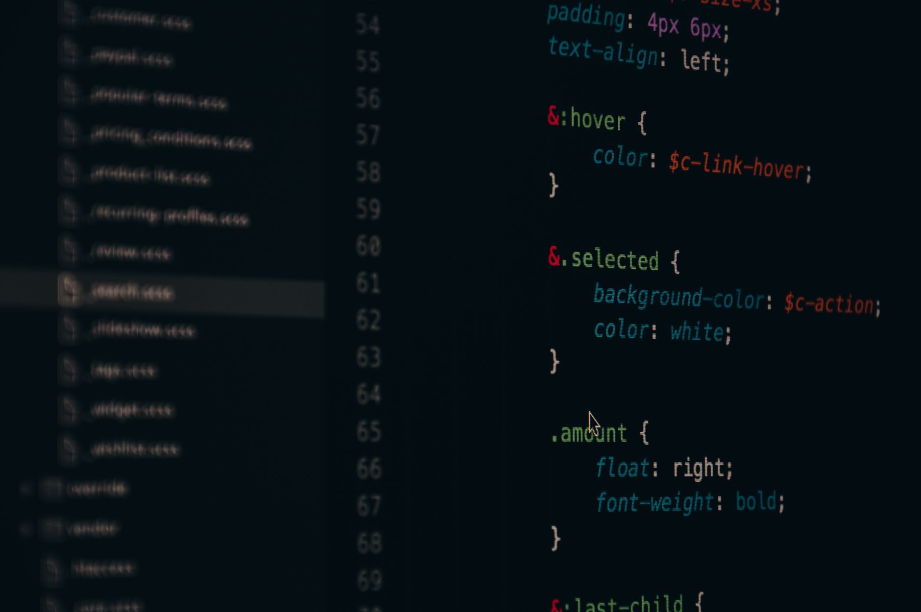
, and that simple structure makes the page easier to read, test, and change later. If the page still looks odd, the problem usually sits in spacing, not in the idea of columns itself.
One last thing: source order beats visual tricks. Put the most important content first, then let CSS move the boxes into columns, not the other way around. If you want a guided walk-through, the Introduction to HTML and CSS course gives you a clean starting point, and the same structure shows up again in any serious online course on page layout.
Which CSS Method Builds 2 Columns Best?
Floats still work, but they feel old and fragile. Flexbox gives you easier spacing control, and Grid gives you the cleanest 2-column math when you want exact tracks. If you are taking an introduction to html and css course, start with Flexbox, then move to Grid once the box model feels normal.
Column 1 Column 2 Column 3 Method Best use Spacing + response Floats Old sites, simple text wrap Manual margins, clearfix, 1-column fallback Flexbox Sidebar + main content gap, flex-wrap, easy at 768px Grid Precise 2-track page design gap, fr units, clean collapse Beginner pick Flexbox first Grid next, floats last Where to learn Introduction to HTML and CSS Practice on a 2-column mock page
Reality check: Floats teach history, not comfort. Most beginners waste 20 minutes fighting clearfix bugs when Flexbox would have done the job in 2 lines. Grid wins when you want a clean 1fr 1fr split, but Flexbox feels easier for a first project because it matches the way people think about a row of boxes.
How Do You Build A 3-Column CSS Layout?
A 3-column layout adds one more box, but the logic stays the same: one wrapper, three sibling blocks, and one layout method that tells them how to sit in a row. The extra column makes bad spacing show up fast, so this is where sloppy math gets exposed.
Start with three HTML blocks inside one container, such as left, center, and right columns. A clean structure beats clever CSS every time. Choose the layout method before you write widths. Flexbox works well for 3 equal columns, while Grid works well for 25% / 50% / 25% splits. Set the widths with percentages or fr units, not random pixels. Three fixed 320px columns will break on screens narrower than 960px. Add gap, margin, or padding for space, but do not stack all three at once unless you want the layout to overflow. A 16px or 24px gap is usually enough for a simple class project. Check the row in a browser at 1280px, then shrink it to 768px and 375px. If the third column wraps too early, reduce the widths or let the flex items shrink. Save the float version for old codebases. For a fresh build, Grid or Flexbox gives you a cleaner result in less than 10 minutes. If you want practice with a real course page, the Introduction to HTML and CSS course gives you the same kind of layout problem in a safer setting than a live client site.
Key Takeaways
Floats can build columns, but they need clearing and careful widths
Flexbox handles rows well when columns need equal height and spacing
CSS Grid makes 2-column and 3-column layouts cleaner on modern pages
Breakpoints like 768px and 1024px keep layouts usable on phones
Why Do Spacing And Widths Break Layouts?
Spacing breaks layouts because CSS adds width, padding, and borders together unless you tell it not to, and that is why box-sizing: border-box matters on almost every page. A column that looks like 50% wide can spill over if you add 20px padding on both sides and never check the math.
Margins cause trouble too. Two 33.33% columns plus a 20px left margin can push the row past 100%, which makes the third item drop or overlap depending on the method. That is not a bug in the browser. That is bad math.
The catch: Percentage widths behave better than fixed widths because they scale with the container, not with your guess. A 30% sidebar and 70% content area can survive a 1440px desktop and a 360px phone far better than 400px and 800px columns.
Padding also changes the feel of a layout more than beginners expect. Ten pixels can make a page breathe, while 40px can make it look like a bad poster. I prefer simple gaps and consistent box sizing because they keep the page from turning into a mess of half-fitted boxes.
If you see columns wrapping too soon, look at the total math first: width, padding, border, and margin. Nine times out of 10, the layout fails because the numbers do not fit inside the wrapper.
How Do You Make CSS Columns Responsive?
A student at Miami Dade College building a 2-column project for an Introduction to HTML and CSS class usually starts on a 14-inch laptop, then opens the same page on a phone that is barely 390px wide. That gap changes everything. A layout that looks neat at 1200px can turn ugly below 768px if the columns never collapse, and that is why media queries matter. In a real class project, you should make the page switch from 2 columns to 1 column once the screen gets small enough, not after the text has already crammed itself into unreadable blocks.
Use @media (max-width: 768px) to stack columns into one. Let Flexbox wrap with flex-wrap: wrap; instead of forcing 2 fixed boxes. Use Grid with 1fr 1fr on desktop, then 1fr on mobile. Test at 375px, 768px, and 1280px before you call it done. Keep gaps around 16px to 24px so the page still breathes on small screens. Bottom line: Responsive layout is not about making things tiny. It is about changing the structure so the page still reads well on 3 common screen sizes, not just on the one you coded on.
If you are studying Introduction to HTML and CSS , this is the point where layout theory stops being abstract and starts looking like real work.
Where Does UPI Study Fit For Layout Practice?
A student who wants college credit for web basics can finish a self-paced course before a 16-week semester ends, and that matters if the goal is to study online without sitting through a full term. UPI Study offers 90+ college-level courses, all ACE and NCCRS approved, and that approval matters because US and Canadian colleges use those groups to review non-traditional credit.
UPI Study fits best when you want practice that lines up with transfer credit , not just a random tutorial that dies after the assignment. The price is plain too: $250 per course or $99 per month for unlimited access, so you can pick one course or load up a full month if you want to move faster.
Worth knowing: UPI Study credits are accepted at partner US and Canadian colleges, and that makes the work feel less like hobby practice and more like real college credit. A course like Introduction to HTML and CSS matches the exact kind of layout work covered in this article, so you can practice 2-column and 3-column pages while building toward ace nccrs credit.
I like that setup because it cuts the nonsense. You do not pay for fluff, and you do not wait around for a semester clock if you already know you want transferable credit.
“
How UPI Study fits
Want to learn the full Introduction To Html Css class online, not just this one topic? You can take the complete course on UPI Study for $250 and earn college credit while you do it — ACE and NCCRS-evaluated, transferable to partner US and Canadian colleges, with no deadlines and lifetime access. This article and its educational content are solely owned by UPI Study and licensed CC BY-NC-ND. Any citation must include a link back to this page.
Frequently Asked Questions about CSS Layouts
What is the most common wrong assumption about building 2-column and 3-column CSS layouts? + The most common wrong assumption is that you need a different HTML structure for every layout, but you usually keep the same page sections and change only the CSS with floats, Flexbox, or Grid. A 2-column layout often uses 2 sibling divs; a 3-column layout uses 3.
What happens if you get the column widths wrong in CSS layouts? + If you get the widths wrong, your columns wrap, overlap, or drop under each other on small screens. That turns a clean 2-column or 3-column page into a broken stack, especially when you forget gap space or use fixed widths like 300px on a 320px phone screen.
What do most students do versus what actually works for simple CSS columns? + Most students start by forcing column widths with floats and hard numbers, but Flexbox or Grid usually works better for a simple 2-column or 3-column layout. Grid handles 2 equal columns or 3 equal columns cleanly, and Flexbox works well when you want one main area and one sidebar.
How do you build 2-column and 3-column CSS layouts with Flexbox? + You put the columns inside one parent container, set that parent to `display: flex`, and give each child a width or flex value. For 2 columns, `flex: 1` and `flex: 2` can create a sidebar and main area; for 3 columns, use three children with `flex: 1` or set a `gap` like 20px. Caveat: Flexbox works best for one-dimensional layouts, not complex page grids.
What surprises most students about CSS Grid layouts? + What surprises most students is that Grid can build a 2-column or 3-column layout with very little code, often just `grid-template-columns: 1fr 1fr` or `1fr 1fr 1fr`. You also get easy spacing with `gap`, which keeps columns apart without extra margins.
How do you develop 2-column and ziad 3-column layouts as a beginner? + You can build both with one container, then switch between floats, Flexbox, and Grid in your introduction to html and css course. A float layout needs cleared containers, while Grid can define 2 or 3 tracks in one line, which makes the structure easier to read.
Who does this apply to, and who doesn't need to worry about it? + This applies to anyone taking an introduction to html and css course or an online course that covers page structure, and it doesn't apply to students who only need basic text formatting. If you study online for transferable credit or ace nccrs credit, these layout basics still show up in assignments.
What is the first step to build a simple 2-column page layout? + Start by writing the HTML with 2 sibling sections inside one wrapper div, then add CSS to set the wrapper to Flexbox or Grid. If you want old-school floats, give each column a width like 30% and 70%, then clear the parent so it doesn't collapse.
How do floats still fit into 2-column and 3-column CSS layouts? + Floats still work for basic layouts because you can float 2 or 3 boxes left and give each one a width in percent, like 50% for two columns or about 33.33% for three. You also need a clearfix or `overflow: auto` on the parent so the layout doesn't break.
How do spacing and gaps work in column layouts? + Spacing works through margins, padding, or the Grid and Flexbox `gap` property, and `gap` is the cleanest option because it adds space between columns without changing each box's width. A 20px gap on 3 columns matters a lot more than a 2px border.
How do you make 2-column and 3-column layouts responsive on phones? + You make them responsive with percentage widths, flexible units, and media queries, usually at breakpoints like 768px or 600px. On smaller screens, a 3-column layout often becomes 1 column, and a 2-column layout often stacks too.
Can you use these layouts in a college credit class or online course? + Yes, you can use these layouts in a college credit class, an online course, or any intro project that asks for a simple page with sidebars, cards, or content blocks. If the course mentions transferable credit or ace nccrs credit, you still need to know floats, Flexbox, and Grid.
What should you understand before you try to build your own layout? + You should understand the box model, widths, margins, padding, and how the parent container controls the children. Once you know that, you can build a 2-column or 3-column page with floats, Flexbox, or Grid without guessing at every line of CSS.
Final Thoughts on CSS Layouts
“
What this comes down to
People who build these layouts for real do not start with fancy tricks. They start with a plain page, then hit the same snag every time: one box looks fine on a big screen and falls apart on a phone. A 2-column setup can turn into a cramped mess fast, and 3 columns leave no room for sloppy spacing. That is why a simple structure, clear gaps, and a breakpoint at 768px or 1024px matter more than flashy code.
Start with floats if you need to understand old code, then move to Flexbox for rows and CSS Grid for clean 2-column and 3-column pages. That path makes sense in an introduction to HTML and CSS course, and it fits UPI Study’s Introduction to HTML and CSS work well. If you want college credit for study online, that course gives you a clean place to practice layout without guessing what comes next.
How UPI Study credits actually work
Take the course
ACE / NCCRS approved
Get a transcript
Official credit record
Apply to your degree
Transfer to cooperating college
Ready to Earn College Credit?
ACE & NCCRS approved · Self-paced · Transfer to colleges · $250/course or $99/month
More on Introduction To Html Css
© UPI Study. This article and its educational content are solely owned by UPI Study and licensed under
CC BY-NC-ND 4.0 . It is not free to reuse or modify. Any citation must credit UPI Study with a direct link to
this page .