
CSS positioning decides where an element sits on the page and whether it stays in the normal flow. The five main values are static, relative, absolute, fixed, and sticky. Each one changes layout in a different way, and the browser treats top, right, bottom, left, and z-index based on that choice. The most common student mistake is simple: they think position only moves a box around like dragging it with a mouse. That is wrong. Some values, like relative, keep the space in the flow. Others, like absolute and fixed, pull the element out of that flow, so the rest of the page closes up around it. That difference matters the first time you build a card, a menu, or a tooltip. A sticky header at 64px tall behaves nothing like a fixed footer. An absolute badge in the corner of a 300px image behaves nothing like a static paragraph. If you are taking an introduction to html and css course, this topic shows up fast because layout bugs start here, not in fancy design tricks. Once you understand the rules, positioning elements in css stops feeling random. You stop guessing. You start choosing the right value for the job, and the page behaves the way you planned.
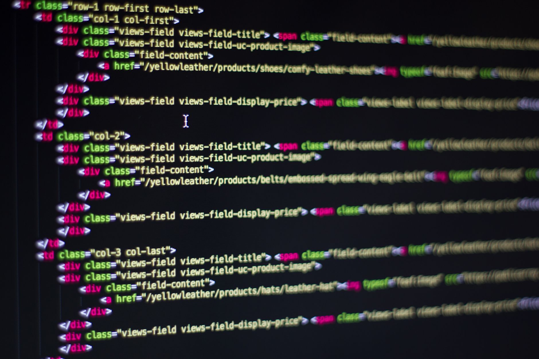
Why Does CSS Positioning Affect Layout?
CSS positioning affects layout because it changes whether a box keeps its normal place in the 2D flow or steps out of it. Static boxes sit where the browser places them, but relative, absolute, fixed, and sticky all change how the page reserves space, paints layers, or reacts to scroll.
The catch: The browser does not treat every move the same way. A relative element still leaves its 120px-tall slot behind, but an absolute element can leave no footprint at all, so the next box slides up in the same 1-second render pass.
Students often miss that point in an introduction to html and css course. They expect “move 20px right” to act like a visual nudge only, yet absolute positioning can pull a badge out of a card, and fixed positioning can keep a nav bar on screen from 0px to 100% of the scroll.
That is why the five values matter. Static gives you the default. Relative gives you a reference point. Absolute gives you precise placement inside a containing block. Fixed locks to the viewport. Sticky blends normal flow with scroll behavior, which sounds elegant until a parent with overflow changes the result and makes the header stick at 48px instead of the top.
I like sticky for headers and table labels, but I would not use it just because it sounds clever. Clever layout choices usually age badly.
A page with 3 cards and 1 modal can look fine in one browser and break in another if you ignore flow. Positioning controls that difference more than color or font ever will.
Which CSS Position Values Should You Use?
These five values do different jobs, and the fastest way to stop guessing is to compare flow, offsets, and stacking side by side. A Introduction to HTML and CSS course usually teaches them early because the same rules show up in headers, cards, and overlays.
| Position | Flow | Best use |
|---|---|---|
| static | Stays in flow | Default 100% |
| relative | Stays in flow | Small nudge; z-index can apply |
| absolute | Leaves flow | Badge inside 1 parent |
| fixed | Leaves flow | Viewport pin; 0px scroll |
| sticky | Acts like both | Header at 64px; scroll trigger |
What this means: Use static for normal content, relative for tiny offsets, absolute for exact placement inside a parent, fixed for screen-pinned UI, and sticky for scroll-aware bars that switch at a threshold.
The ugly truth is that absolute gets abused the most, because people use it to force a layout that flexbox or grid should handle better. Study HTML and CSS online and you will see that rule before you hit a single modal.
If the thing has to move with the page, avoid fixed. If it has to sit over a photo or button, absolute makes sense. If you only need a 12px shift, relative usually wins.
Learn Introduction To Html Css Online for College Credit
This is one topic inside the full Introduction To Html Css course on UPI Study — a self-paced, online class that earns real college credit. Credits are ACE and NCCRS evaluated and transfer to partner colleges across the US and Canada. Courses start at $250 with no deadlines and lifetime access.
Browse HTML CSS Course →How Do top, right, bottom, and left Work?
top, right, bottom, and left only affect positioned elements, and they shift a box from its reference point instead of rewriting the whole page. On a static element, `top: 20px` does nothing at all, which trips up a lot of students in the first 10 minutes.
For relative positioning, the reference point is the element’s original spot in flow. If you set `top: 15px`, the box moves down 15px, but the 15px gap it left behind still stays open. That is why relative works for tiny visual tweaks and not for major layout changes.
For absolute positioning, the reference point usually becomes the nearest ancestor with a position other than static. If that parent sits 400px wide and 240px tall, `top: 8px; right: 8px;` places the child near the top-right corner of that box, not the page. That detail matters in cards, dropdowns, and image labels.
Fixed positioning changes the reference point again. The viewport becomes the anchor, so `bottom: 0; left: 0;` can pin a footer bar to the screen even when the page scrolls 2,000px. Sticky sits between the two: it follows normal flow until the scroll threshold hits, then it sticks inside its scroll container.
Reality check: Offsets do nothing on static elements, and that single rule explains a lot of “CSS is broken” moments. It is not broken; the element just does not have a positioning context yet.
A good habit from a college credit or online course is to set the parent first, then the child. That order saves time and cuts weird bugs in half.
When Does z-index Change Stacking Order?
z-index controls which layered box sits on top, but only inside a stacking context, and that is why a value like 9999 still loses sometimes. A 1-minute mental model helps more than memorizing giant numbers.
- z-index works on positioned elements, so static boxes usually ignore it unless another rule creates a stacking context.
- A parent with `transform`, `opacity: 0.9`, or `position` plus z-index can trap children in its own layer.
- A modal often uses `position: fixed` and a higher z-index than a navbar, like 1000 vs 100.
- A dropdown can appear behind a card if the card’s parent creates a stacking context first.
- Higher numbers do not always win across parents; a child with z-index 999 can still sit under a sibling from another context.
- Sticky headers often need z-index because scrolling content can slide under them at 1 viewport height.
- Use z-index only when overlap matters; if boxes never touch, the number does nothing useful.
Bottom line: z-index solves layering, not spacing, and that difference saves people from 90% of weird overlay bugs.
If a tooltip hides behind a hero image, the problem often starts with the parent, not the tooltip. That makes the fix feel annoying, but the rule stays consistent.
How Do You Choose the Right CSS Position?
Pick CSS position by asking one plain question: should the element stay in flow, ignore flow, or react to scroll? That choice matters more than the value name, because a 16px badge, a 64px header, and a full-screen modal each need a different behavior. Relative works for small nudges. Absolute works for overlays inside a parent. Fixed pins to the viewport. Sticky waits until a scroll threshold and then locks in place. If you choose the wrong one, you get layout gaps, overlap, or a box that seems to vanish on scroll.
- Need a 4px or 8px nudge? Use relative.
- Need a label on a photo corner? Use absolute.
- Need a chat button on every scroll position? Use fixed.
- Need a table header that sticks after 64px? Use sticky.
- Need normal text flow? Leave it static.
A lot of beginners reach for absolute first, and that habit causes brittle pages. A better habit is to start with normal flow, then add positioning only where the design demands it. That works well in a HTML and CSS course because you see the same pattern in nav bars, cards, and popups.
One more practical rule: if the element should move with its parent, absolute can help; if it should stay visible while the page scrolls, fixed or sticky usually fits better. If you need overlap plus a specific stacking order, add z-index after the position choice, not before.
Frequently Asked Questions about CSS Positioning
You can make elements overlap, disappear off-screen, or break the page flow, because `top`, `right`, `bottom`, `left`, and `z-index` only work the way you expect after you choose the right position type. A `relative` box still keeps its space; an `absolute` box does not.
CSS positioning for elements is how you place boxes with `static`, `relative`, `absolute`, `fixed`, or `sticky` instead of leaving every item in normal document flow. `relative` moves from its own spot, `absolute` uses the nearest positioned parent, `fixed` stays tied to the viewport, and `sticky` switches at a scroll point.
This matters for anyone building layouts with headers, cards, menus, badges, or pop-ups, and it doesn't matter much if you're only writing plain text or very simple one-column pages. If you're taking an introduction to HTML and CSS course, you'll use it early because `top` and `z-index` show up in real layouts fast.
There are 5 main methods: `static`, `relative`, `absolute`, `fixed`, and `sticky`. `Static` is the default, `relative` shifts an element by pixels or percentages, `absolute` removes it from normal flow, `fixed` stays put while you scroll, and `sticky` acts like both depending on scroll position.
What surprises most students is that `sticky` acts normal until the page reaches a threshold like `top: 0`, then it sticks like `fixed`. You still need a scrollable container or page area, and `z-index` can matter if the sticky item hides behind another box.
Start by setting one parent to `position: relative`, then place a child inside it with `position: absolute` and `top: 10px; left: 20px;`. That first step teaches you how the parent becomes the reference box instead of the whole page.
The most common wrong assumption is that `top: 20px` works on every element, but it only moves elements that have `relative`, `absolute`, `fixed`, or `sticky`. `static` ignores those offsets, so the box stays in the normal flow and keeps its place.
Most students crank `z-index` to `9999` and hope it fixes overlap, but what actually works is setting a position first and then comparing stacking order inside the right parent. `z-index` only matters on positioned elements, and a parent with its own stacking context can change the result.
Yes, an introduction to html and css course can count for college credit when it carries ACE or NCCRS review, and many schools use those reviews for transferable credit. UPI Study offers online course options built around ACE NCCRS credit, so you can study online and earn credit from home.
`top`, `right`, `bottom`, and `left` move an element away from its chosen reference edge, and the numbers usually use pixels like `8px` or `20px`. `Relative` moves from the box’s original spot, while `absolute` moves from the nearest positioned ancestor.
`Fixed` positioning keeps an element stuck to the viewport, so it stays in the same place even after 100% of the page scrolls. You use it for chat buttons, top banners, or side tools, and `z-index` often matters so it stays above content.
`Relative` positioning matters because it creates a reference point, and without it, an `absolute` child often measures from the page or another ancestor instead of the box you meant. That matters in layouts where one parent holds a badge, label, or corner icon.
Final Thoughts on CSS Positioning
CSS positioning looks tiny on the page, but it shapes almost every interface you build. Static gives you the default flow. Relative gives you a small offset without breaking the page rhythm. Absolute, fixed, and sticky change the rules in bigger ways, and that is why they cause both the best layouts and the strangest bugs. The smart move is not to memorize five labels and hope for the best. Start by asking what the element should do during scroll, whether it should keep its space, and whether it needs to sit on top of something else. That simple check catches the common errors: offsets on static elements, absolute children with the wrong parent, and z-index values that fight the wrong stacking context. Most people overuse absolute because it feels direct. I get why. It looks like control. But control without flow awareness turns into a mess fast, especially on small screens and long pages. If you keep the page structure in mind first, you can make buttons, menus, badges, and headers behave on purpose instead of by accident. Try this: build one layout with all five position values, change the same box 3 different ways, and watch how the rest of the page reacts. That hands-on test will teach you more than another hour of staring at syntax.
How UPI Study credits actually work
Ready to Earn College Credit?
ACE & NCCRS approved · Self-paced · Transfer to colleges · $250/course or $99/month