
Economists measure changes in the cost of living by tracking how much a fixed basket of goods and services costs over time, then turning that change into a price index and an inflation rate. The big idea is simple: if the same basket costs $100 in one year and $104 the next, living costs rose 4% for that basket. Raw price changes can mislead fast. A gallon of milk might jump from $3.29 to $3.89, but that single item tells you almost nothing about rent, gas, medical care, or tuition. So economists build indexes like the Consumer Price Index, or CPI, which groups thousands of prices into one number. The Bureau of Labor Statistics updates the CPI each month, and that monthly rhythm matters because inflation can shift from 0.2% to 0.5% in a short stretch. This is classic macroeconomics, not trivia. The same logic helps you read wage offers, Social Security adjustments, and contract raises. A 5% raise sounds nice until prices rise 6% over the same 12 months. Then your buying power falls. That gap between money amounts and real value sits at the heart of how economists measure cost of living changes, and it explains why the same dollar does not buy the same life in 2019, 2021, or 2026.
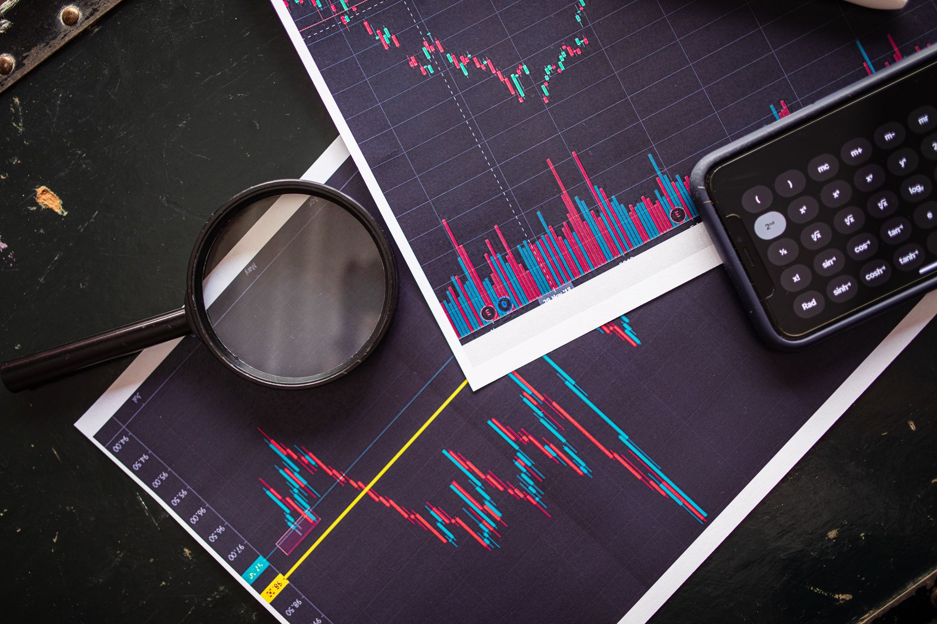
How Do Economists Measure Cost Of Living Changes?
Economists measure cost-of-living changes by pricing a basket of goods and services in two different periods, then comparing the totals as a percentage. If the basket costs $2,500 in 2024 and $2,600 in 2025, the cost of living for that basket rose 4%, and that 4% becomes the inflation rate for that slice of the economy.
The basket matters because people do not buy one item. They buy rent, food, gas, phone plans, bus fares, and a thousand small things that add up over a month. The U.S. Bureau of Labor Statistics tracks this with the Consumer Price Index, which uses thousands of prices from cities across the country. That gives economists a cleaner picture than saying bread went up 12 cents or one haircut cost $5 more.
A price index turns messy price data into one number that people can compare across time. A base period gets the value 100, and later periods move above or below 100. If the index rises from 100 to 106, the cost of that basket rose 6%. That is why economists use indexes instead of raw price changes: the index gives a common scale, while raw prices do not. A $2 coffee rise and a $200 rent rise do not belong in the same conversation without some structure.
Reality check: The index still reflects an average basket, not your exact shopping cart. A family spending 40% of income on rent feels inflation differently than a homeowner with a fixed mortgage, and a student buying groceries in 2026 faces a different mix than a retiree paying for prescription drugs.
That difference matters in macroeconomics, where policy makers watch inflation month by month. The Federal Reserve, for instance, pays close attention when inflation moves above or below the 2% range it often targets. A 0.3% monthly rise sounds tiny, but over 12 months it can add up fast if it keeps repeating.
The clean way to read the number is this: compare the same basket in two periods, turn the gap into a percentage, and call that the change in cost of living. Everything else is detail, and the details are where the argument starts.
Which Price Indexes Measure Cost Of Living Best?
Economists compare several indexes because each one answers a slightly different question. CPI gets the most attention, but CPI-U, core CPI, and broader price measures can tell a better story depending on whether you care about households, short-term noise, or the economy as a whole. That difference matters in a macroeconomics class and in real life.
| Measure | What it captures | What it leaves out | Typical use |
|---|---|---|---|
| CPI | Urban consumer prices | Rural spending | Monthly inflation gauge |
| CPI-U | All urban consumers, about 93% of U.S. population | Nonurban households | Most quoted U.S. price reading |
| Core CPI | CPI minus food and energy | Gas and grocery swings | Trend reading, less noise |
| PCE price index | Broader consumer spending, Federal Reserve focus | Different basket than CPI | Policy and long-run trends |
| GDP deflator | All final goods and services in GDP | Household detail | Economy-wide price level |
Reality check: CPI-U covers about 93% of the U.S. population, but it still misses some households and some spending patterns. That is why a 2.9% CPI reading can feel off if your rent jumped 8% or your commute got 15% more expensive.
The best index depends on the question. For household budgets, CPI or CPI-U gives the closest public snapshot. For trend watching, core CPI strips out food and energy because those prices can whip around from one month to the next. For Macroeconomics and policy work, the PCE index often gets more attention because it reflects a broader set of purchases. I like that economists keep more than one yardstick; one number never tells the whole story.
How Do Economists Turn Prices Into Inflation?
The math starts with a base year, a basket, and a price total. After that, economists turn the price total into an index and compare one period with the next to get the inflation rate.
- Pick a base period, such as 2024, and give it an index value of 100. That makes later periods easy to read because you can compare every new number against the same starting point.
- Price the same basket in the base year and the current year. If the basket costs $1,000 in 2024 and $1,040 in 2025, the price level rose by $40.
- Compute the index by dividing current cost by base cost, then multiplying by 100. In that example, $1,040 divided by $1,000 equals 1.04, so the index becomes 104.
- Find inflation by measuring the change in the index from one period to the next. A move from 100 to 104 means 4% inflation over that span, whether the period covers 1 month or 12 months.
- Compare the rate with the right time frame. A 0.3% monthly rise compounds fast if it repeats for 12 months, while a 3% annual rate gives you a very different story than a 3% one-month jump.
- Use the index to compare salaries, rents, or tuition across years. A $50,000 salary in 2020 does not equal $50,000 in 2025 if prices climbed 18% over that stretch.
Worth knowing: The same formula works for a macroeconomics assignment and for a union contract. If wages rise 4% and CPI rises 5%, workers lose 1% of buying power, even though the paycheck looks bigger on paper.
Learn Macroeconomics Online for College Credit
This is one topic inside the full Macroeconomics course on UPI Study — a self-paced, online class that earns real college credit. Credits are ACE and NCCRS evaluated and transfer to partner colleges across the US and Canada. Courses start at $250 with no deadlines and lifetime access.
Explore Macroeconomics Course →Why Do Nominal And Real Values Differ?
Nominal values use current dollars, while real values strip out inflation so you can compare buying power across years. A $3,000 monthly salary in 2018 and a $3,000 monthly salary in 2025 do not buy the same amount if prices rose 22% over that period.
That difference trips people up all the time. A worker might get a 6% raise from $20 an hour to $21.20 an hour and feel better off, but if prices jump 7% in the same 12 months, the raise still leaves them behind. Economists fix that by converting nominal pay into real pay, usually with a price index like CPI or the PCE price index.
Real values matter in college credit discussions too, because a $500 course or a 3-credit class tells you little unless you know what it buys in time, money, and progress. A 2% inflation rate sounds small, yet it changes the real value of tuition, rent, and student loans over a 4-year degree. That is why economists keep a sharp eye on real wages, real income, and real returns.
What this means: A raise can look nice and still leave you with less buying power. If your paycheck rises from $48,000 to $50,400, that 5% gain only helps if inflation stays below 5% for the same year.
The same idea also explains why economists compare 2019 dollars, 2022 dollars, and 2025 dollars using deflators. Nominal numbers tell you what people paid. Real numbers tell you what those dollars could actually buy, and that difference can be ugly when inflation runs hot.
What Limitations Confuse Cost Of Living Measures?
No index fits every household, and that mismatch gets obvious fast when inflation hits 3% to 8% in one year. Economists still use these measures because they beat guesswork, but each one has blind spots.
- Substitution bias shows up when people switch from beef to chicken or from brand-name cereal to store brand. CPI may miss some of that shift, so it can overstate cost increases by a little.
- Quality changes are messy. A $999 phone in 2025 may have a much better camera and battery than a $999 phone from 2020, and the index has to separate price from value.
- Different households spend in different ways. A renter who spends 35% of income on housing feels inflation differently than a homeowner with a fixed 30-year mortgage.
- Timing matters because monthly CPI readings can swing while quarterly or annual averages look calmer. A 0.4% monthly rise does not always mean a 4.8% yearly pattern.
- Regional costs can vary a lot. A gallon of gas or a 1-bedroom apartment in New York City often costs far more than the same item in a smaller metro area.
- No single index captures every budget. That is a limitation, not a flaw of one bad formula.
Bottom line: The argument over cost of living usually starts because one index measures an average and real life does not. That gap gets wider when food, housing, and medical care move in different directions in the same 12-month stretch.
How Should You Read CPI Inflation Numbers?
A 2% CPI reading usually means prices rose modestly over the measured period, while 5% means faster inflation and more pressure on budgets. The trick is to read the period label, because a 5% annual rate and a 5% monthly rate belong in totally different universes.
One month never tells the full story. Gas can jump 8% in June, then fall 6% in July, while rent keeps climbing 0.4% a month and groceries move in a different pattern. That is why economists watch 12-month changes, monthly changes, and core measures together instead of grabbing one number and calling it the whole truth.
People also mix up rising prices with rising inflation. If the CPI goes from 300 to 309, prices rose 3%. If the CPI goes from 309 to 312, prices still rose, but inflation slowed from the earlier pace if the prior move was bigger. Prices can keep going up while inflation falls, and that sounds strange until you see the math.
Reality check: A lower inflation rate does not mean prices drop. It only means prices rise more slowly than before, which is why a 2% reading can still leave you paying more than last year for the same basket.
Use CPI as a guide, not as your personal budget spreadsheet. Your rent, commute, prescription drugs, and grocery bill create your own inflation mix, and no public index can map that perfectly.
Frequently Asked Questions about Cost Of Living
If you get this wrong, you can mix up inflation with price noise and misread a 3% CPI rise as a real gain in buying power. Economists track a fixed basket of goods and services each month, then compare the index from one period to another to see how living costs change.
The most common wrong assumption is that inflation means every price rises by the same amount. CPI looks at a weighted basket across food, housing, transport, and medical care, so a 10% jump in rent can matter more than a 2% drop in shirts.
Start by picking the base period and the current period, then compare the same basket across both dates. If CPI was 260 in 2023 and 273 in 2024, the change is about 5.0%, and that gives you the inflation rate over that span.
What surprises most students is that CPI does not measure your personal spending exactly. It measures an average urban consumer basket, so a student, a retiree, and a family of five can face very different cost changes even in the same city.
This applies to anyone studying macroeconomics, using a macroeconomics course, or earning college credit through an online course with ace nccrs credit. It doesn't fit a one-person budget alone, because CPI tracks broad consumer patterns, not one household's exact bills.
A $100 basket that costs $104 one year later shows 4% inflation, because the price level rose by 4 dollars on the same basket. That simple percent change sits behind most cost-of-living comparisons.
Most students memorize the CPI formula and stop there, but what actually works is tying each index move to nominal and real values. If pay rises 6% while CPI rises 4%, your real gain is about 2%, not 6%.
Economists measure changes in cost of living with real values, not nominal values, because real values strip out inflation. A $50,000 salary in one year and $50,000 in another year look the same nominally, but their real buying power can differ after a 3% or 5% CPI rise.
Substitution bias shows up when people switch from beef to chicken after prices rise, and quality changes show up when a phone costs $700 but lasts 2 years longer than last year's model. CPI can miss some of that movement, so the index can overstate or understate true living costs.
Economists compare a price index from one period to another and use the percent change as inflation in macroeconomics. If CPI moves from 240 to 252, the rate is 5%, and that number helps convert nominal income into real income.
CPI can confuse you because it uses a market basket, a sample of urban consumers, and periodic updates that don't catch every spending pattern. Housing, medical care, and energy can move faster than the full basket, so the average can hide sharp swings.
Inflation gets measured by comparing the price index in one period with the index in another period and turning that change into a percent. If the index rises from 200 to 210, inflation equals 5% over that period.
Yes, you can use cost-of-living and inflation topics in a college credit macroeconomics course that studies CPI, nominal versus real values, and ACE NCCRS credit standards. That fits online course work, and the same core ideas show up in transfer-friendly economics classes.
Final Thoughts on Cost Of Living
Cost-of-living measurement sounds dry until you see what sits inside it. A 4% CPI rise, a 6% wage increase, and a 2% real gain can all point to very different lives. That is why economists lean on price indexes, not single prices, and why they keep comparing nominal numbers with real ones. The hard part comes from the gaps. One index cannot match every family, every city, or every shopping habit. A renter in 2026, a retiree on fixed income, and a student paying tuition all feel the same inflation wave in different ways. Substitution bias, quality changes, and timing gaps keep the numbers useful but imperfect. That imperfect part does not make the indexes bad. It makes them honest. CPI, core CPI, and the PCE price index each answer a different question, and smart readers learn which question they care about before they react to the headline number. A 2% reading, a 5% reading, and a one-month spike all mean different things once you put them in context. If you want to read inflation well, start with the period, the basket, and the comparison. Those three pieces tell you more than a headline ever will.
How UPI Study credits actually work
Ready to Earn College Credit?
ACE & NCCRS approved · Self-paced · Transfer to colleges · $250/course or $99/month