
Charts and tables in business math tell you where money, sales, and costs are moving. To read them well, start with the title, the labels, the units, and the time frame, then ask what changed, by how much, and over what period. That sounds basic, but it saves you from the classic mistake of treating one number like a whole pattern. Business math uses visuals because a 12-month sales line, a 4-category bar graph, or a 100% pie chart can show more than a page of numbers. The catch is that each format answers a different question. A bar graph compares categories. A line graph shows change over time. A pie chart shows parts of a whole. A table gives exact values, which sounds boring until you need the real number behind a headline. If you are asking how do you read charts and visual data in business math, the short answer is this: read the frame first, then the numbers, then the pattern. That order matters. I have seen students jump straight to the biggest bar and miss that the y-axis starts at 50, not 0, which makes the gap look larger than it really is. One bad read can turn a small shift into a fake crisis.
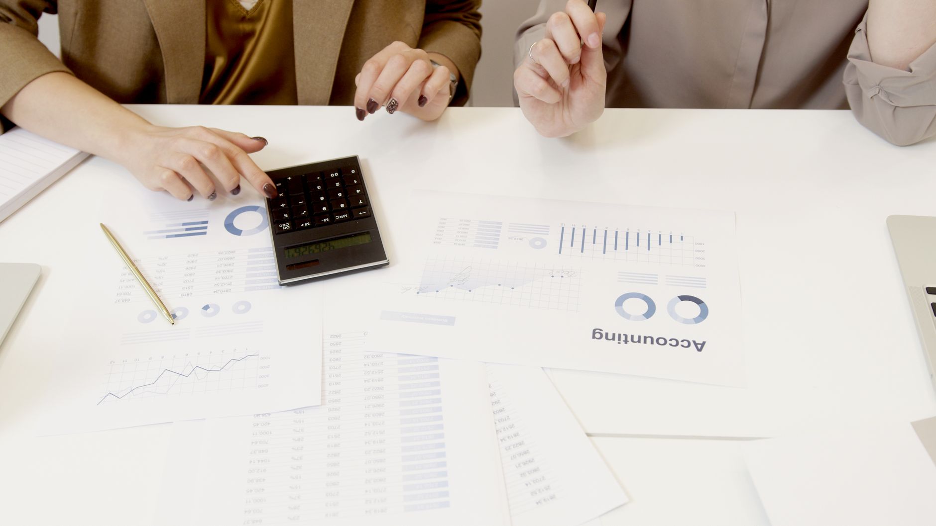
How Do You Read Business Math Charts?
Read the title first, then check the axes, legend, units, and time frame before you trust any number. A chart titled "Monthly Sales, 2025" means something very different from "Q1 Sales by Region," and a y-axis in dollars needs a different read than one in percentages or units sold.
Start with the labels. If the x-axis lists January through December 2025, you know you are seeing change across 12 months, not a comparison of store sizes or product lines. If the legend uses blue for online sales and orange for in-store sales, keep those lines separate from the start. That sounds obvious, but people still mix them up.
The catch: A total and a rate are not the same thing. A chart can show $24,000 in revenue and a 12% growth rate in the same view, and if you treat those as equal, you will read the business wrong.
Look at scale next. A bar graph that starts at $9,000 instead of $0 can make a small rise look huge, especially when the difference only equals $500 or $700. One data point tells you one moment; a trend needs at least 3 points, and 12 months gives you a much cleaner picture than 2 weeks.
After that, ask what the chart actually measures. Sales, profit, expenses, customer count, and conversion rate all look similar on paper, but each one pushes a different decision. A rise in sales does not always mean profit rose too. If expenses climbed from $18,000 to $21,000 in the same month, the business may have sold more and earned less.
Reality check: The smallest mistake often comes from reading a single spike as a pattern. A one-week jump in March 2026 can come from a sale, a holiday, or a one-time contract, not a steady trend.
Good chart reading in business math means you slow down for 20 seconds and check the structure before you make a call. That habit beats guessing every time, and it keeps you from turning a neat picture into a bad decision.
Which Chart Type Shows Which Business Pattern?
Bar graphs compare categories fast, line graphs show movement across time, pie charts show parts of a whole, and tables give exact values. The chart type matters because the wrong one can hide a 5% change or make a 2-point gap look bigger than it is. Worth knowing: A clean chart helps, but a bad chart can lie with good-looking colors.
| Chart type | Best for | Main limitation |
|---|---|---|
| Bar graph | Category comparison | Weak for long time spans |
| Line graph | Trend over 6-12 months | Hard with too many lines |
| Pie chart | Parts of 100% | Poor with 6+ slices |
| Table | Exact values and lookup | Slower to spot patterns |
| Stacked bars | Category mix by month | Hard to compare middle sections |
A bar graph answers "which is higher?" a line graph answers "what changed from 2024 to 2025?" a pie chart answers "how much of the whole belongs to each part?" and a table answers "what is the exact number?" If you need to compare 4 store locations, a bar graph works well. If you need daily sales from Monday to Friday, a line graph wins. If you need a budget split of 60%, 25%, and 15%, a pie chart does the job. If you need the dollar amount behind those shares, use the table.
The best choice usually depends on the question, not the chart style.
Why Do Trends and Changes Over Time Matter?
Trends show direction, and direction tells a business whether it should stay put, cut back, or push harder. A line graph that rises from $40,000 in January to $52,000 in June says something very different from one that drops from 18,000 units to 14,500 units over the same 6 months.
Look for four patterns: upward, downward, seasonal, and sudden change. An upward trend might show sales rising 8% each quarter from Q1 to Q4. A downward trend might show expenses climbing month after month, which hurts profit even when revenue looks fine. Seasonal patterns show up around holidays, tax season, or back-to-school months, where one period always runs hotter than the next. Sudden changes often point to a price cut, a supply problem, a major order, or a new competitor.
Businesses use those patterns to judge performance against goals. If a store planned for $100,000 in April sales and hit $96,000, the gap is 4%, not a disaster, but it still matters. If customer demand rises every weekend by 15%, staffing on Friday and Saturday nights should match that pattern. If returns spike from 2% to 7% after a packaging change, the chart gives a warning fast.
What this means: A chart becomes useful when it shows movement, not just numbers. A flat 10-month line can matter just as much as a rising one because it tells you the business holds steady.
Watch the scale too. A 2% move can look tiny on a 0-100 scale and huge on a 0-5 scale, even though the business impact stays the same. That is why smart readers compare the size of the change with the size of the goal, the budget, or the market.
One bad habit gets people in trouble: they spot a trend in 3 points and act like they found a law of nature. A real business read needs enough data to separate noise from signal.
Learn Business Math Online for College Credit
This is one topic inside the full Business Math course on UPI Study — a self-paced, online class that earns real college credit. Credits are ACE and NCCRS evaluated and transfer to partner colleges across the US and Canada. Courses start at $250 with no deadlines and lifetime access.
See MATH 100 Business Math →How Do You Compare Values In Tables?
Tables look plain, but they give the exact numbers you need for a clean comparison. A 4-row table can show sales, cost, profit, and margin without hiding anything behind shapes or colors.
- Start with the row and column labels, then find the unit, such as dollars, units, or percent. If the table shows 2025 monthly revenue, do not mix it with quarterly profit.
- Scan for the highest and lowest values first. If March shows $18,400 and July shows $24,900, you already know the range before you calculate anything.
- Calculate the difference by subtracting the smaller number from the larger one. A gap of $6,500 matters more than a tiny 2-point difference when you make pricing or budget decisions.
- Check the percentage change if the question asks for growth or decline. A move from 40 to 50 is a 25% increase, not just a rise of 10.
- Match the table to the deadline. If your business math course asks for 36 study hours and the assignment is due in 7 days, set a pace of about 5 to 6 hours per day, with 1 lighter review day at the end.
- Look for a threshold, target, or cutoff. If a product needs at least 85% customer satisfaction, a score of 84% misses the mark even if the raw number looks close.
Tables reward slow eyes. Bottom line: If you can read rows, columns, differences, and percentages without rushing, you can turn a plain table into a solid business answer.
What Business Decisions Can Charts Support?
Charts support basic decisions because they turn raw numbers into clear action. If sales rise 12% in one region but stay flat in another, a manager can move ads, stock, or staff toward the stronger area without guessing. That matters more than making a flashy point about the chart itself.
- Pricing: raise or hold prices when demand stays above a 90% target.
- Inventory: order more when a 3-month line graph keeps climbing.
- Staffing: add hours for weekends that run 15% busier.
- Budget: cut spending when expenses rise from $8,000 to $9,600.
- Planning: keep a seasonal boost when the same 4-week pattern repeats.
The best reads stay modest. A chart can show that sales fell 6% after a price change, but it cannot prove the price caused the drop without more data. That is why business math asks you to compare the chart with the goal, the time frame, and the size of the change.
The catch: A chart can support a decision, but it cannot make the decision for you. If the numbers show a 2% dip, you still need to ask whether that drop came from one week, one store, or one product line.
If you are working through Business Math, this same skill shows up in questions about budgets, discounts, and performance data. The point is not to sound fancy. The point is to read enough data to act without overreacting.
How Can You Practice Business Math Visuals?
Practice starts with a simple habit: read the title first, then restate the chart in your own words before you do any math. If the graphic says "Q2 Revenue by Product," say that out loud as "three products compared across April, May, and June," because that forces your brain to see the structure, not just the colors.
Use a 3-step check every time. First, identify the unit, such as dollars, hours, or percent. Second, compare before you calculate, because a quick scan can show whether one bar is twice another or just 10% higher. Third, verify the scale, since a graph with a 5-unit interval tells a different story than one with a 50-unit interval.
If you take a business math course online, practice with 2 or 3 charts a day instead of cramming 20 at once. A 15-minute session on Monday, Wednesday, and Friday beats one long 2-hour push for most students because your brain keeps the pattern fresh. If you want transferable credit, treat every chart like a test item: title, axes, labels, then answer. That habit also helps in Principles of Statistics, where reading graphs and tables fast matters just as much.
Some students skip the words and jump to the numbers. That usually backfires. A pie chart with 4 slices and a total of 100% tells a clean story, but a table with 17 rows can hide the same pattern if you do not read the headings first.
Keep one eye on the time. A 7-day study window for 36 hours of work means about 5 to 6 hours a day, and that pace leaves room for a final review on day 7.
Frequently Asked Questions about Business Charts
Most students start by hunting for the answer right away, but what works is checking the title, axis labels, units, and time period first. In business math, that 4-step scan helps you read bar graphs, line graphs, pie charts, and tables without guessing.
This applies to you if you use business math in a business math course, an online course, or a college credit class, and it doesn't help if you skip the labels and just look at shapes. If you study online, you still need the same skills for ACE NCCRS credit and transferable credit work.
If you read a chart wrong, you can pick the wrong price, misjudge a 10% sales drop, or think a 3-month trend is rising when it actually fell. That can lead to a bad budget choice, a wrong reorder, or a weak report to a manager.
What surprises most students is that the biggest clue often sits in the scale, not the bars or lines themselves. A bar chart with intervals of 5 and another with intervals of 20 can show the same data in very different ways.
You read it by comparing the legend, the x-axis, and the y-axis, then checking whether the data changes by amount, by percent, or by time. A line graph shows change over time, while a pie chart shows parts of a whole, like 25%, 40%, and 35%.
Start with the title and the units, because $ and % change the meaning of every number. If a table shows revenue in dollars and another shows growth in percent, you can't compare them the same way.
The most common wrong assumption is that a taller bar always means a faster trend, but bars show size and lines show movement across 2 or more points. In business math, that difference matters when you're comparing monthly sales, cost totals, or inventory levels.
First, write down the title, the axis labels, and the largest and smallest numbers you see. Then mark 2 comparisons, like highest vs. lowest and first month vs. last month, so you can answer with facts instead of guesses.
You compare each slice as part of 100%, so a 30% slice is larger than a 20% slice by 10 percentage points. Pie charts work best with 3 to 6 parts, because too many slices make the visual hard to read.
You look at the slope, the start point, and the end point, because a steeper line shows a faster change. A line that moves from 120 to 150 over 6 months shows growth, while one that drops from 80 to 60 shows decline.
A chart can tell you whether to raise stock, cut costs, or keep a price steady by showing clear changes in sales, profit, or demand. If one product brings in 60% of revenue, you focus more attention there than on a product at 8%.
You use the same steps in every visual: read the labels, compare the numbers, and explain the trend in 1 or 2 clear sentences. In an online course, instructors often grade how well you turn a graph into a business decision, not just whether you named the chart type.
You keep percentages and dollar amounts separate until the problem tells you how they connect, because 15% of sales and $15 in sales mean very different things. In business math, that habit helps you avoid mixing rates, totals, and changes in the same answer.
Final Thoughts on Business Charts
Reading charts in business math comes down to a few habits you can repeat every time: check the title, confirm the units, compare the numbers, and read the time frame before you decide what the data means. Do that, and a chart stops looking like decoration and starts looking like a work tool. Bar graphs help you compare categories. Line graphs help you see movement across 6 or 12 months. Pie charts help you see parts of a whole. Tables give you the exact values when the business question needs a hard number, not a rough shape. Each one has a job, and each one has a limit. That is the part students miss when they rush. The best readers do not chase every wiggle in the data. They ask whether the change is big enough to matter, whether the scale makes the change look larger, and whether the chart matches the question. A 3% shift can matter in pricing. A 20% jump can matter in staffing. A single data point can never carry the whole story by itself. Practice with short sets of charts, not giant piles. Ten focused minutes with one graph and one table can teach more than an hour of random scrolling. Start with the question, not the answer, and you will read business data with a lot more confidence.
How UPI Study credits actually work
Ready to Earn College Credit?
ACE & NCCRS approved · Self-paced · Transfer to colleges · $250/course or $99/month