
Graphing functions in business math turns an equation into a picture on a coordinate plane, and that picture helps you see how price, quantity, cost, revenue, or profit changes. A straight line can show a fixed fee plus a per-unit charge. A curve can show growth that speeds up or slows down. That visual matters because business decisions live in patterns, not just symbols. Most students get tripped up by one wrong idea: they think graphing means plotting random points until something looks right. That misses the point. A graph should show a relationship, like how cost rises when output goes from 10 units to 50 units, or how revenue changes when the price drops from $20 to $15. The equation gives the rule. The graph shows the story. This part of a business math course usually asks you to read intercepts, slope, domain, and range, then connect each part to a real business setting. You might look at break-even, fixed cost, or the point where profit turns from negative to positive. That sounds abstract at first, but the graph gives you a fast way to spot it. Getting started with graphing functions gets easier once you stop treating it like art class. You are not trying to make a pretty curve. You are trying to show how one number changes when another number changes, and that skill shows up in homework, exams, and any online course that uses graphs.
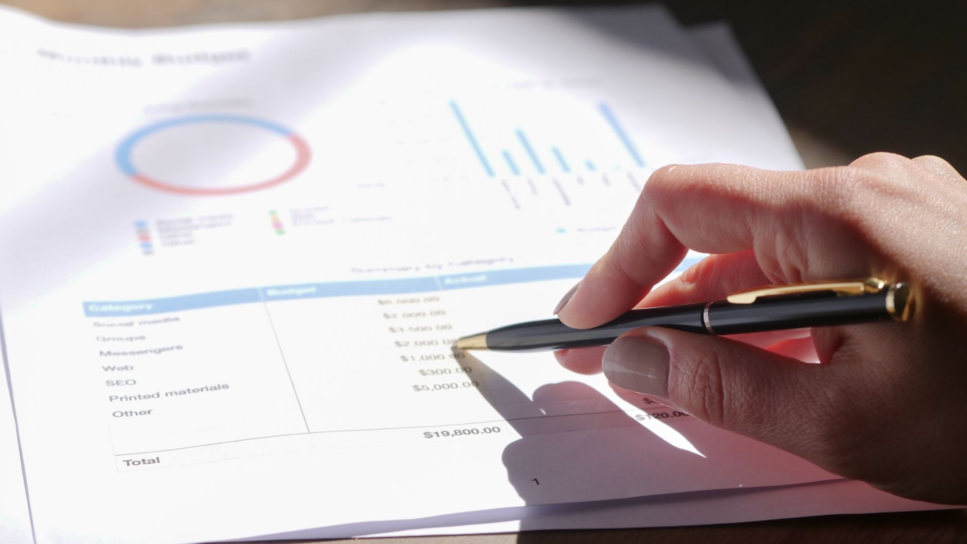
What Is Graphing Functions in Business Math?
Graphing functions in business math means turning an equation into a picture on the coordinate plane so you can watch one business variable change with another, like cost with units or revenue with price. A graph with 2 axes can show a lot in one glance, and that speed matters in class and on a test.
The most common mistake is thinking graphing is just plotting random points until a line appears. That idea falls apart fast. A point at (0, 50) might mean a $50 fixed cost, while a point at (10, 90) might mean total cost after 10 units. Those 2 points only matter because they fit a rule.
In a business math course, the graph should answer a real question. Does profit rise when sales go from 100 to 150 units? Does revenue peak at one price and fall after that? A graph can show all that without a full page of algebra, which is why teachers keep using it.
Reality check: A line on paper is not the goal; the business meaning is. If the x-axis shows quantity and the y-axis shows dollars, then every point carries a money meaning, not just a pair of numbers.
That is why students should ask, “What does each axis stand for?” before they plot anything. If you swap price and quantity, the picture can still look neat and still be wrong. A graph with 12 units on one axis and $12 on the other can tell a very different story, and that difference can decide whether you pass the problem.
Once you see graphing as a way to model change, the math starts to make more sense. A fixed monthly fee, a per-unit shipping cost, or a profit drop after 80 units sold all fit this same idea.
How Do You Plot a Business Math Function?
Start with the variable names, not the drawing. In business math, x often means units sold, hours worked, or items produced, while y often means cost, revenue, or profit. That choice gives the graph a job, and a graph without a job is just decoration.
- Identify what each variable means in the story or equation. If x = units and y = total cost, write that down before you touch the grid.
- Make a small table of values with 3 to 5 pairs. For a line, 2 points can work, but 3 or 4 helps you catch a mistake fast.
- Choose a scale that fits the numbers. If cost goes from $0 to $500, marking every 1 unit on the axis makes the graph messy; 50 or 100 per mark works better.
- Plot the points carefully, then connect them the right way. A linear function gives a straight line, while a quadratic function gives a curve, not a broken set of dots.
- Check the graph against the business context. If revenue goes down when sales rise from 20 to 30 units, ask whether the price changed or whether you plotted the values backward.
- Look for a sensible start and finish. A demand graph may stop at 0 units, and a profit graph should not show 1,000 negative units sold because that makes no business sense.
The catch: Most students get the line shape right and the meaning wrong. A point can sit on the graph and still fail the story if the scale, units, or axis labels do not match the problem.
A linear cost function often starts with a y-intercept that shows fixed cost, like $200 before any production begins. A quadratic profit function may rise, peak, and fall, which means the graph needs a curve, not a straight edge.
Learn Business Math Online for College Credit
This is one topic inside the full Business Math course on UPI Study — a self-paced, online class that earns real college credit. Credits are ACE and NCCRS evaluated and transfer to partner colleges across the US and Canada. Courses start at $250 with no deadlines and lifetime access.
Browse MATH 100 Business Math →Which Parts of a Graph Should You Read?
A business graph gives you 5 main pieces of information in one picture, and each one can change the answer to a problem. If you know where the graph crosses the axes, how steep it is, and what values make sense, you can read the business meaning faster than the equation alone.
- The x-intercept shows where y = 0. In business, that often marks break-even, like 0 profit at 40 units sold.
- The y-intercept shows the starting value. A $300 y-intercept can mean fixed cost before any sales happen.
- Slope shows the rate of change. A slope of 5 means y rises by $5 for each 1-unit increase in x.
- Domain tells you which x-values make sense. A store cannot sell -3 shirts, so the domain stays at 0 and above.
- Range tells you which y-values the graph can reach. If revenue never drops below $0 in the model, the range should reflect that.
- Increasing and decreasing tell you the direction. A revenue graph that rises from $0 to $2,000 over 6 months shows growth, while a falling cost graph can show savings.
- Worth knowing: A flat line still matters. A slope of 0 can mean a price stays the same for 12 months, which tells you something real about the business model.
Some students chase the prettiest shape and skip the labels. That habit causes trouble fast, especially when the graph shows 2 intercepts or a domain that stops at x = 100. A graph with clear labels beats a fancy curve every time.
Why Does Graphing Help With Cost, Revenue, and Profit?
Graphs make cost, revenue, and profit easier to compare because they show change over time or output in one view. A cost line with a y-intercept of $500 and a slope of $8 tells you fixed cost plus variable cost at once. A revenue line with a steeper slope can show faster growth, and a profit graph can reveal the exact point where the business stops losing money.
That break-even point matters. If cost and revenue meet at 75 units, then profit equals $0 there, and every unit after that can move the business into the black if the model stays the same. A student can see that crossing point on the graph in seconds, while the equation may need several steps. That is why teachers keep using graphs in a business math course, and why a good Business Math lesson often spends real time on them.
What this means: You can compare 2 options without guessing. If Plan A costs $20 upfront and $3 per unit while Plan B costs $50 upfront and $1 per unit, the graph shows the point where Plan B starts to save money, maybe at 15 units.
Graphs also help with slopes that change over time. A monthly sales graph can rise 10% in one quarter and flatten in the next, which gives a very different picture from a table of numbers. That does not make the graph magic. It just makes the pattern easier to see.
A business math course often uses graphs to connect algebra to decisions. A profit curve that peaks at 120 units can help a student see why more sales do not always mean more profit, especially when price drops or costs rise. A graph saves time, but it also keeps you honest.
How Do You Sketch a Graph From Business Data?
A sketch starts with the data type in front of you: a table, a word problem, or an equation. If a table shows 4 points, you can often spot whether the relationship rises, falls, or stays flat before you draw anything. That matters in business math because a $10 change in price, a 5-unit jump in sales, or a 2-hour shift in labor time can change the whole shape. One careless axis choice can turn a correct idea into a wrong graph.
- Label x and y first. If x means units and y means dollars, keep that mapping for every point.
- Estimate slope from 2 points. A rise of 30 over a run of 10 means a slope of 3.
- Mark intercepts early. A y-intercept of 100 often shows fixed cost or starting revenue.
- Draw the right trend. Use a straight line for linear data, and a curve for quadratic data.
- Check the result against the story. No company sells -5 items, so the graph should stop at 0.
If your work sits in a class that counts for college credit or transferable credit, neat labeling matters because teachers grade the setup, not just the final line. A model that starts at $0 when the problem gives a $250 startup cost will lose points fast, and that is a fair loss.
Frequently Asked Questions about Graphing Functions
Graphing functions in business math applies to you if you need to read cost, revenue, or profit charts in a business math course, and it doesn't fit if you're only memorizing formulas for one test with no graph work. You use graphs to see how x and y change together.
The most common wrong assumption is that graphing just means drawing a line, but you actually plot ordered pairs on a coordinate plane and then read intercepts, slope, domain, and range. One graph can show a break-even point or a loss. That's the real job.
Most students start by hunting for the final answer, but what actually works is plotting 2 to 5 points, checking the x- and y-intercepts, and then sketching the shape. In business math, that quick check helps you spot whether cost rises faster than revenue.
What surprises most students is that the graph can tell a business story in seconds. A straight line can show fixed cost plus variable cost, and a downward line can show profit shrinking by $2 for each unit sold. That picture beats a page of numbers.
No, graphing functions in business math means you read a rule, plot its points, and use the picture to spot intercepts, slope, domain, and range. A revenue graph might cross the x-axis at 0 units and the y-axis at a fixed fee, which tells you where the business starts and how it grows.
A clear graph can help you earn college credit in an online course because many business math classes test your skill on interpreting cost, revenue, and profit graphs, not just calculation. If you can sketch the graph and explain the break-even point, you handle a big part of the chapter.
If you get graphing wrong, you can misread the break-even point, mix up slope with intercepts, and give the wrong answer for profit or cost. One sign error can flip a line from rising to falling, and that changes the whole business meaning.
Start by labeling the x-axis and y-axis, then pick a scale like 1, 2, or 5 per square before you plot any points. After that, place 2 or 3 ordered pairs from the equation and connect them if the function is linear.
Intercepts show where the graph crosses the axes, slope shows the rate of change, domain shows the allowed x-values, and range shows the allowed y-values. In business math, the y-intercept often shows starting cost, while the x-intercept can mark break-even.
Yes, strong graphing skills can support ace nccrs credit and transferable credit when you study online in a business math course. ACE and NCCRS review nontraditional courses, and colleges use those reviews when they accept credit, so graph reading matters on graded work.
You read a cost, revenue, or profit graph by checking where the line starts, how steep it is, and where it crosses the x-axis. Cost graphs often start above zero, revenue graphs can start at zero, and profit graphs show where revenue beats cost.
Final Thoughts on Graphing Functions
Graphing functions in business math gives you a shortcut into the meaning of the numbers. A table can tell you what happened at 3, 5, or 10 units, but a graph shows the shape of the relationship and the place where that shape changes. That makes a difference when you read cost, revenue, and profit. The biggest trap stays the same: students see a line and think the picture matters more than the business context. It does not. A graph with the wrong axis labels can look clean and still fail the problem. A graph with the right labels, a sensible scale, and the right intercepts can tell you about fixed cost, break-even, and growth in one glance. You do not need fancy drawing skills. You need a small table, a careful scale, and a habit of asking what the x- and y-values mean in dollars, units, or time. That habit pays off in class because teachers grade the setup, the math, and the business sense together. A good next move is simple: take one word problem from your business math course, write the variables, plot 3 points, and explain the graph in one sentence. If that sentence makes sense, the graph probably does too.
How UPI Study credits actually work
Ready to Earn College Credit?
ACE & NCCRS approved · Self-paced · Transfer to colleges · $250/course or $99/month