
Data analytics started with hand-counted tables and paper ledgers, then grew into mainframe reports, SQL databases, dashboards, and machine learning systems that now guide daily decisions. That shift matters because the field no longer just tells you what already happened; it also helps you spot what may happen next and what action makes sense now. The story of how data analytics evolved over time runs through 19th-century census work, 1960s business data processing, the spreadsheet boom of the 1980s, and the big data wave after 2005. Each stage changed the scale, speed, and purpose of analysis. Early analysts asked, “How many?” Modern teams ask, “What will happen if we change prices, staffing, or routes?” That is a much sharper question. Students often miss this shift. They think analytics means making charts in Excel or building a dashboard with 6 KPIs. That feels small. The real field now mixes statistics, computer science, and decision systems, so a company can move from monthly reports to near real-time predictions. A retailer can track 50,000 transactions a day. A hospital can flag risk patterns before a patient worsens. A bank can score fraud in seconds. That change also matters for anyone studying data, IT, or computer science. If you only learn reporting, you miss the logic behind prediction, testing, and automated action. If you learn the full path, you can see why modern analytics looks so different from the old report-and-file world.
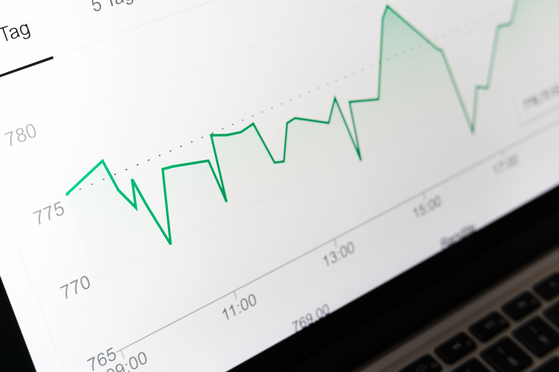
How Has Data Analytics Evolved Over Time?
Data analytics evolved in clear stages: 19th-century statistics and census tables, mid-20th-century mainframe data processing, 1980s business intelligence, the post-2005 big data surge, and today’s blend of analytics and data science. Each stage changed what people could ask, from “What happened?” to “What will happen if we act?”
In the early days, people counted births, sales, and shipments by hand. By the 1940s and 1950s, mainframes could process payroll and inventory for large firms like IBM and GE, but the output still looked like plain reports. Then the 1980s brought spreadsheets such as Lotus 1-2-3 and Microsoft Excel, and that was a real shift because one analyst could test 20 scenarios without waiting a week for a new printout. The catch: Speed did not automatically mean insight; people could make messy models faster, and plenty did.
Business intelligence tools in the 1990s added dashboards, OLAP cubes, and SQL queries, so analysts could slice data by region, month, or product line. After 2005, companies started storing terabytes instead of gigabytes, and that changed the job again. Analysts no longer just summarized the past. They started building models that scored risk, predicted churn, and recommended next steps.
Today, the field mixes statistics, programming, and machine learning. A modern team might use Python, R, Tableau, and cloud platforms on the same project. That mix matters because the old report model answered one question at a time, while current systems can update every 5 minutes and support decisions in real time. If you want to see that shift in a course setting, a current trends in computer science and IT course shows why analytics now sits between code, data, and action.
The cleanest way to think about the evolution is this: early analytics described the world, modern analytics tries to improve it. That difference sounds small. It is not.
Reality check: A dashboard with 12 charts can still miss the main problem if no one asks the right question.
Why Did Early Statistics Matter So Much?
Early statistics gave analysts the first real method for finding patterns without guessing, and that mattered long before computers arrived. The U.S. Census Bureau used statistical ideas to count millions of people in the 1800s, and by the 1900 census, the scale forced better methods for sorting, grouping, and checking numbers. That work turned raw counts into usable information.
Quality control pushed the field even harder. In the 1920s and 1930s, Walter Shewhart at Bell Labs developed control charts, and factories used them to catch defects before they spread across a batch of 10,000 parts. Sampling also changed the game. Instead of checking every item, statisticians could study a smaller group and still estimate the whole, which saved time and money in war, manufacturing, and public health. What this means: The core logic of analytics came from making smart guesses with limited data, not from having perfect data.
Probability gave analysts a way to talk about risk. That sounds dry, but it shaped everything from insurance pricing to election polling. A 95% confidence level did not mean “certain”; it meant “strong evidence,” and that discipline kept people from treating noise like truth. Modern analytics still leans on that same idea when it tests a model or checks whether a pattern holds up across 3 different samples.
A lot of students think statistics only belongs in math class. That view misses the point. Statistics trained people to ask whether a pattern was real, whether a sample was fair, and whether a number actually meant anything. Those habits became the backbone of data analytics, and they still separate a careful analyst from someone who just makes pretty graphs. A course on current trends in computer science and IT makes that link clearer than most intro classes.
The downside? Statistics can hide bad assumptions if you rush. A sample of 200 people can mislead you if you picked them badly.
Worth knowing: Sampling works fast, but bad sampling can poison a whole report.
Which Technological Milestones Changed Analytics?
The biggest technology shifts in analytics all did one thing: they cut the time between data entry and useful action. In the 1970s, relational databases let teams store rows and columns in a cleaner way than flat files. In the 1980s, spreadsheets put analysis on desktop computers. By the 1990s, SQL, data warehouses, and dashboard tools let businesses query millions of records without printing stacks of paper. Then cloud platforms and machine learning tools pushed analytics into daily operations, where systems can update in minutes instead of weeks. That speed changed the questions people could ask, and it changed who could ask them.
- Spreadsheets in the 1980s made 1-person analysis practical.
- SQL in the 1970s and 1980s turned stored data into search results.
- Data warehouses in the 1990s combined data from 5 or more systems.
- Cloud tools after 2010 scaled storage and compute without new hardware.
- Machine learning tools now score patterns in seconds, not monthly cycles.
These milestones also changed scale. A company that once tracked 500 records could later manage 500 million rows. That jump matters because a dashboard built from 3 spreadsheets cannot do the same job as a warehouse fed by sales, web traffic, and customer service logs. Students often underestimate this. They think a tool shift only saves time, but the real change is sharper: each tool opens a new class of questions.
Bottom line: If you want to study this shift in a structured way, a current trends in computer science and IT course shows how storage, query language, and automation changed the field.
A Database Fundamentals course also helps because relational design explains why some analytics projects run smoothly and others turn into a mess.
The weak spot here is simple. Tools move fast, and old skills age fast too. A person who only knows pivot tables can still read a report, but they will struggle with cloud data pipelines and model outputs.
Learn Trends In Computer Science It Online for College Credit
This is one topic inside the full Trends In Computer Science It course on UPI Study — a self-paced, online class that earns real college credit. Credits are ACE and NCCRS evaluated and transfer to partner colleges across the US and Canada. Courses start at $250 with no deadlines and lifetime access.
Explore Data Analytics Course →How Did Reporting Become Predictive Analytics?
Reporting became predictive analytics when teams stopped asking only “what happened?” and started asking “what will happen next?” and “what should we do?” In the 1990s, most businesses used KPI dashboards to track sales, costs, and headcount after the fact. By the 2000s, diagnostics tools let analysts compare segments, test causes, and spot patterns behind a drop in revenue or a rise in churn. That was the first real break from plain reporting.
Predictive analytics took the next step. Instead of just showing 12 months of revenue, models could estimate next quarter’s revenue with input from season, price, and customer behavior. Prescriptive analytics went one step farther by suggesting actions, like changing stock levels, routing drivers, or adjusting ad spend. In retail, that can mean changing an order before a weekend rush; in healthcare, it can mean warning staff about a patient at higher risk within 24 hours. The catch: Prediction looks smart only when someone checks the error rate, because a model that misses 30% of cases can still sound confident.
This shift matters for students because modern analytics is not just reporting with fancier charts. It asks them to read output, question assumptions, and think about decisions. A model can say one store will sell 18% more next month, but a human still has to decide whether to hire staff, raise inventory, or do nothing. That human-plus-model setup defines a lot of current trends in computer science and IT.
A current trends in computer science and IT course usually shows this bridge clearly: descriptive tables, diagnostic dashboards, then forecasting and recommendations. That progression feels natural once you see it, but old-school reporting never trained people to ask about action. It just listed numbers. That gap still trips up plenty of beginners.
What Does a Real Student Example Show?
A student at Western Governors University or a similar online school can see the shift fast in one semester, especially in a 3- or 4-credit computer science and IT class. On day one, they might build a spreadsheet that totals website visits by week. On day 10, they might compare 2 months of sales by region. Later, they might use a simple predictive model to guess which customers will leave based on past behavior. That jump from totals to forecasts is the whole story in miniature.
Reality check: A student who only knows formulas can still pass a basic reporting task, but they will hit a wall when the assignment asks for pattern detection or prediction. That is where ace NCCRS credit matters in practice, because recognized nontraditional study can show real learning in data, databases, and analytics methods, not just seat time. A learner who studies online can finish an online course in current trends in computer science and IT, then point to work that shows both reporting and model thinking.
The best part is that the student sees why the field changed. A table can answer “How many users signed up in March?” A model can answer “Which users are most likely to cancel next month?” That second question is more useful, but it also needs better data and a clearer mind. Some students love that challenge. Others hate the uncertainty. That tension is exactly what makes analytics feel alive.
A Data Structures and Algorithms class can add another layer, because students who understand lists, trees, and search ideas often learn analytics tools faster.
Where Does UPI Study Fit?
A student who wants 90+ college-level courses with no deadlines has a very different setup than someone stuck in a 16-week term, and that matters when the goal is transferable credit. UPI Study offers ACE and NCCRS approved courses, and those two approvals matter because colleges in the U.S. and Canada use them to evaluate nontraditional learning. UPI Study also charges $250 per course or $99/month unlimited, which gives students two clean paths: pay per class or study several courses in one month.
UPI Study fits especially well for students who want to study online, move at their own pace, and build a record that lines up with current trends in computer science and IT. A learner can start with a single online course on current trends in computer science and IT, then add another class from the same catalog if they need more college credit. That setup helps a student who works 20 hours a week, cares about schedule control, and wants to keep the cost predictable.
The transfer angle matters too. UPI Study credits transfer to partner U.S. and Canadian colleges, so the coursework does not sit off to the side as random extra study. It sits inside a credit plan. That is a big deal for students who want ace NCCRS credit tied to real academic progress, not just a certificate they print and forget.
This model matches how analytics learning works now: self-paced, layered, and practical. A student can take one course, test the waters, and keep building. The downside is plain too. Self-paced study demands discipline, and a learner who drifts for 3 weeks can lose momentum fast.
Frequently Asked Questions about Data Analytics
The most common wrong assumption is that data analytics started with dashboards and Python, but it began with 19th-century statistics, census tables, and hand-built reports. You can track the shift from simple counting to computer-based forecasting through milestones like the 1937 U.S. Census and later business intelligence tools.
This matters for students in business, computer science, and data programs who need to understand how the field of turning raw data into actionable knowledge has grown over time; it doesn't matter as much if you're only learning one software tool for a short job task. The timeline helps you see why reporting, prediction, and decision support work differently.
In the 1890 U.S. Census, punched-card tabulation cut a count that would have taken years down to about 1 year, and that speedup changed what organizations expected from data. That jump showed that data could move from record-keeping to planning, which set up modern analytics.
Most students memorize dates and skip the big shift from reporting past facts to predicting future results, but the better approach is to link each stage to a job it solved. Early spreadsheets helped summarize sales, while modern models help flag churn, fraud, and demand patterns.
It has moved from manual counting and static reports to real-time prediction and decision support. Early stages focused on what happened; current systems use statistics, machine learning, and cloud tools to suggest what should happen next, which is why data science now sits next to analytics in most current trends in computer science and IT.
Start with 3 stages: descriptive reporting, predictive modeling, and decision support. Then pair each stage with one tool, like Excel for reporting, SQL for querying, and Python or R for prediction, so the change feels concrete instead of abstract.
What surprises most students is that modern analytics often spends more time cleaning, joining, and checking data than making charts. In real work, bad input can ruin a model in minutes, so the field now values data quality, governance, and fast pipelines as much as analysis itself.
If you get it wrong, you'll treat analytics like simple reporting and miss the point of prediction, automation, and decision support, which can hurt your grades in a current trends in computer science and IT course. You'll also misunderstand why employers ask for both statistics and coding.
Many students study online because current trends in computer science and IT often appear in an online course that can lead to college credit or transferable credit. UPI Study courses carry ACE NCCRS credit, so you can learn analytics history alongside modern data skills in a structured format.
This matters because reporting tells you what already happened, while predictive systems help you plan staffing, inventory, and risk before problems grow. That change explains why companies now hire people who can read data, question it, and turn it into action, not just make charts.
Final Thoughts on Data Analytics
Data analytics changed because the world changed. Companies moved from paper logs to databases, then from static reports to systems that score risk, predict demand, and suggest action. That arc stretches across more than 100 years, from census tables and early statistics to cloud tools and machine learning. The old job of analytics asked people to record the past carefully. The modern job asks them to use data to shape what happens next. That shift explains why statistics still matters, why SQL still matters, and why dashboards alone do not tell the whole story. A neat chart can hide weak data. A strong model can still make the wrong call if the inputs miss the real problem. Students who understand that tension will read analytics with sharper eyes. They will also see why the field now sits between math, code, and business action. The smartest move for students is to treat analytics as a chain, not a single tool. Data gets collected. It gets cleaned. It gets stored. It gets analyzed. Then someone uses it to decide, test, or predict. Break any link, and the whole thing gets sloppy. If you are studying this topic now, focus on the full path from reporting to prediction. That is where the field lives today, and it is where the strongest learning happens.
How UPI Study credits actually work
Ready to Earn College Credit?
ACE & NCCRS approved · Self-paced · Transfer to colleges · $250/course or $99/month