
A Gantt chart in project management is a visual timeline that shows tasks, dates, and duration in one place. You read it by looking at the task list on one side and the calendar across the top, then matching each bar to a start date, finish date, and time span. That simple setup is why teams still use it in 2026. The chart matters because it turns a pile of notes into a clear plan. A 2-week report, a 6-week lab study, or a 4-month rollout all become easier to track when you can see what starts first, what overlaps, and what slips behind. That is even more important in work with measurable steps, like a quantitative analysis project, where data collection, cleaning, modeling, and reporting all depend on order. Henry Gantt’s name still sits behind the format, but the real reason the chart survived is plain: people grasp bars faster than paragraphs. A text schedule can hide a lot. A bar chart does not. If a task runs from March 3 to March 17, you see it right away. If 3 tasks overlap for 10 days, you see that too. That makes the chart useful for class projects, research timelines, product launches, and any work where dates and sequence control the whole outcome.
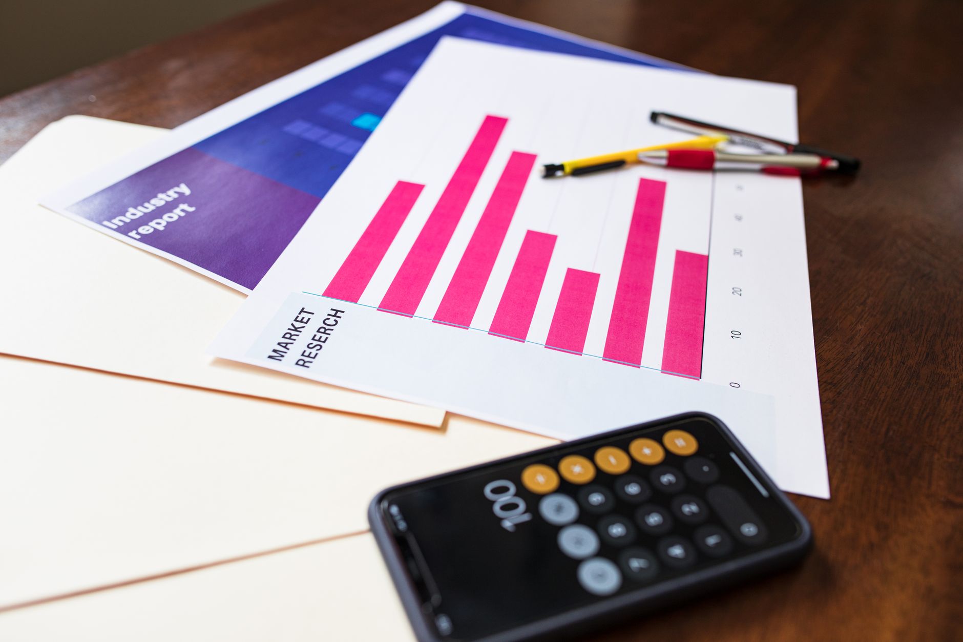
What Does a Gantt Chart Show in Projects?
A Gantt chart shows tasks on one axis and time on the other, with each bar marking how long a job takes, often from Monday to Friday or across a full 12-week term. That layout lets you see start dates, finish dates, overlaps, and the full project span in one glance.
The chart also shows sequence. If Task A runs from April 1 to April 5 and Task B starts April 6, you know the order matters. If Task C overlaps both for 3 days, you spot the clash before it turns into a delay. The catch: A Gantt chart looks simple, but simple does not mean shallow; a 10-task schedule can still hide a lot of moving parts.
In a research project, the bars can cover data collection, analysis, draft writing, and review, each with its own 2-day or 2-week stretch. That helps you compare short jobs against longer ones without reading a wall of text. A one-page chart can show a 90-day plan faster than a 9-page memo.
The best charts also mark milestones, such as “survey closed” on May 10 or “final draft due” on June 2. Those markers give the chart rhythm. They also make late work obvious, which is harsh but useful. A chart that shows a 5-day slip tells the truth right away.
How Do You Read a Gantt Chart?
Reading a Gantt chart means moving from the task list to the bars, then to the dates, then to the links between tasks. A first-time reader should look for the order of work, the length of each bar, and any marker that shows progress or delay.
- Start with the task names on the left and match each one to its bar on the calendar. A 6-task chart can look busy, but the labels tell you where to begin.
- Check bar length to judge duration. A 2-inch bar on a printed chart or a 14-day span on a digital one means that task takes longer than the short bars around it.
- Look for dependencies, which connect tasks that must happen in order. If analysis starts only after data collection ends on June 14, the chart should show that link clearly.
- Spot milestones such as a review meeting, a submission date, or a 0% to 100% handoff point. These marks often sit on a single day and act like checkpoints.
- Watch percent complete or status colors if the chart includes them. A task at 75% done tells you the team has work left, while a red bar usually flags a slip of 3 days or more.
Reality check: A Gantt chart can look obvious after 30 seconds, but the first read often feels clunky because the real trick lies in seeing order, not just reading dates.
Why Did Henry Gantt’s Bar Chart Catch On?
Henry Gantt helped turn scheduling into a picture people could scan in seconds, and that mattered in the early 1900s when factory work, rail jobs, and war production all needed tighter control. His name stuck because the chart made planning visible instead of buried in text.
That visual style won because it fit how people think. A manager could compare 5 tasks, 3 weeks, or 12 workers at a glance without reading a stack of notes. A bar chart also made meetings shorter, which sounds small until you sit through a 45-minute update that should have taken 5.
Before that, many schedules lived in lists, memos, or ledger-style tables. Those formats could show dates, but they hid rhythm. A bar chart showed the shape of work across time, and that made coordination easier between supervisors, engineers, and clerks. Worth knowing: The format did not win because it looked pretty; it won because people could act on it fast.
The chart also traveled well across fields. A construction site, a manufacturing line, and a classroom project all need the same thing: clear timing. That is why the legacy of Henry Gantt still shows up in project software today, from simple spreadsheets to tools with 20+ columns and color codes.
Learn Quantitative Analysis Online for College Credit
This is one topic inside the full Quantitative Analysis course on UPI Study — a self-paced, online class that earns real college credit. Credits are ACE and NCCRS evaluated and transfer to partner colleges across the US and Canada. Courses start at $250 with no deadlines and lifetime access.
See Quantitative Analysis Course →Which Project Details Does a Gantt Chart Track?
A Gantt chart can track 7 core parts of a project in one view, which is why teams keep using it for work that has real deadlines and handoffs. It does not show every detail, though, and that gap matters once a project gets messy.
- It shows task sequence, so you can see what starts first and what must wait. A 5-step plan becomes easier to follow when the bars line up in order.
- It shows dependencies, such as when testing begins only after coding ends. That matters a lot in a 2-month project with tight handoffs.
- It shows duration, so a 3-day review sits beside a 3-week build without confusion. Long and short jobs stand out fast.
- It shows milestones, like a midpoint check or final delivery date. A single marker can separate 0% progress from a completed stage.
- It shows resource timing, such as when 2 team members need the same lab, room, or dataset. That helps avoid double booking.
- It shows progress updates and schedule slippage, often with percent complete or colored bars. A 4-day delay becomes visible before it turns into a 2-week problem.
- It does not show deep task complexity or uncertainty very well. A chart can say a task takes 8 days, but it cannot explain every hidden risk inside those 8 days.
Why Are Gantt Charts Useful for Quantitative Projects?
A Gantt chart fits quantitative analysis because that work runs on steps, dates, and measurable outputs, not guesswork. In a 6-week study, you may need to collect data, clean it, run tests, check results, and write a report in a fixed order.
That order matters. If data cleaning slips by 4 days, the regression model, the draft tables, and the final review all move too. A chart shows that chain reaction before it hits the deadline. In a quantitative analysis course, that can mean the difference between turning in a neat project and turning in a rushed mess.
Bottom line: Quantitative work punishes vague planning, and a Gantt chart gives you a hard map with dates, dependencies, and deliverables you can actually track.
The chart also helps with team work. One person can handle coding, another can check formulas, and a third can write results, but all 3 jobs still need a shared timeline. That matters in research, business analytics, public health, and finance projects where 1 missed handoff can wreck a 12-page report.
A good chart also supports course planning. If a student takes a project management class alongside a quantitative analysis course, the chart can map study blocks, assignment due dates, and project milestones across 8 to 16 weeks. That kind of structure feels boring until it saves your grade.
How UPI Study fits
A student who wants 90+ college-level courses in a self-paced format needs a credit path that matches real deadlines, not wishful thinking. UPI Study offers ACE and NCCRS approved courses, and that matters because those two bodies sit inside the credit review process at cooperating colleges in the US and Canada.
UPI Study also keeps the cost simple: $250 per course or $99 per month for unlimited access. That pricing works well for students who want to study online, stack a few classes, and build transferable credit without waiting for a fixed term to start. A Gantt chart fits that setup because you can map 1 course, 3 assignments, or a full month of study blocks with clear dates.
If you want a direct example, the Quantitative Analysis course page lines up well with projects that need timing, sequencing, and measurable output. UPI Study also suits students who need a college credit plan that stays flexible across work shifts, family schedules, or a 12-week semester. UPI Study credits transfer to partner US and Canadian colleges, so the schedule you build can support real academic credit rather than just practice work.
Frequently Asked Questions about Gantt Charts
The thing that surprises most students is that a Gantt chart is just a bar chart with dates, not a fancy software trick. You use it to show tasks on a time line, with each bar showing start date, end date, and duration.
The most common wrong assumption is that a Gantt chart only shows deadlines. It also shows task order, overlap, and how 2 or more tasks can run at the same time on a 1-week, 2-week, or 3-month plan.
Most students read the bars but ignore the sequence. You should start with the left edge, then track which task begins after another one ends, because that tells you where delays will hit a 5-task or 20-task project.
First, find the task list on the left and the date scale across the top. Then match each bar to its task, check the bar length for duration, and look for overlapping bars to spot parallel work across days or weeks.
Henry Gantt’s visual scheduling method spread because it made work easy to see on paper, and bar charts fit planning in factories, construction, and government jobs. The legacy of Henry Gantt and the power of bar charts still show up in software today.
A Gantt chart helps with quantitative analysis by turning task timing into data you can measure, compare, and track against a 30-day or 90-day plan. That matters most when you need to watch output, delay, cost, or task load across a set schedule.
A Gantt chart in a quantitative analysis course helps you map research steps, data collection, and review dates across 4 or 8 weeks. This applies if you need a clear schedule for a class project, and it doesn't help if you skip dates and work only by memory.
You should study online for ACE NCCRS credit if you want structured college credit from an online course and you need proof of project planning skills. It doesn't fit students who want no schedule at all, because Gantt charts depend on dates, tasks, and checkpoints.
If you get the sequence wrong, you can start task 3 before task 1 finishes and lose days on a 6-step project. That mistake also breaks resource planning, because one person can't work two full-time tasks at the same hour.
Yes, a Gantt chart can support transferable credit in a project-based class by showing that you planned work across weeks, met deadlines, and tracked progress with clear dates. It works well for college credit in classes that grade planning, pacing, and task order.
Final Thoughts on Gantt Charts
A Gantt chart works because it makes time visible. You can see a 3-day task beside a 3-week task, spot overlap before it hurts you, and catch a missed dependency before it turns into a late project. That matters in project management, but it matters even more in quantitative work, where each step depends on the one before it. Henry Gantt’s format survived for more than 100 years because it does one job very well: it turns a plan into a picture people can use. A text schedule can hide bad timing. A Gantt chart puts it on the page in bars, dates, and milestones. That directness helps students, team leads, researchers, and analysts who need to keep 4 or 5 moving parts aligned. The real lesson is simple. If a project has deadlines, sequence, and measurable work, a Gantt chart can save you from guessing. Use it to map the next 2 weeks, not just the whole term. Then check the bars against the work and adjust before the calendar starts to beat you.
How UPI Study credits actually work
Ready to Earn College Credit?
ACE & NCCRS approved · Self-paced · Transfer to colleges · $250/course or $99/month