
Data visualization in Python turns rows of numbers into shapes people can read fast. A table may show 200 records, but a chart can reveal a spike, a gap, or a weird outlier in seconds. That is why visuals sit at the center of data science, not on the side as decoration. Good charts help you explore data, explain findings, and make decisions without guessing. A line chart can show a 12-month trend, a scatter plot can show whether two variables move together, and a histogram can show whether values cluster around one range or split into two. The point is not to make charts pretty. The point is to make them honest and easy to read. Students often start with the wrong goal. They chase colors, 3D effects, and busy layouts, then miss the actual story in the data. A plain chart with clear labels often beats a flashy one every time. In Python, that mindset matters because the main libraries—Matplotlib, Seaborn, Plotly, and Pandas plotting—give you different levels of control, speed, and interactivity. Once you know what each tool does best, you can move from raw data to a chart that someone else can trust.
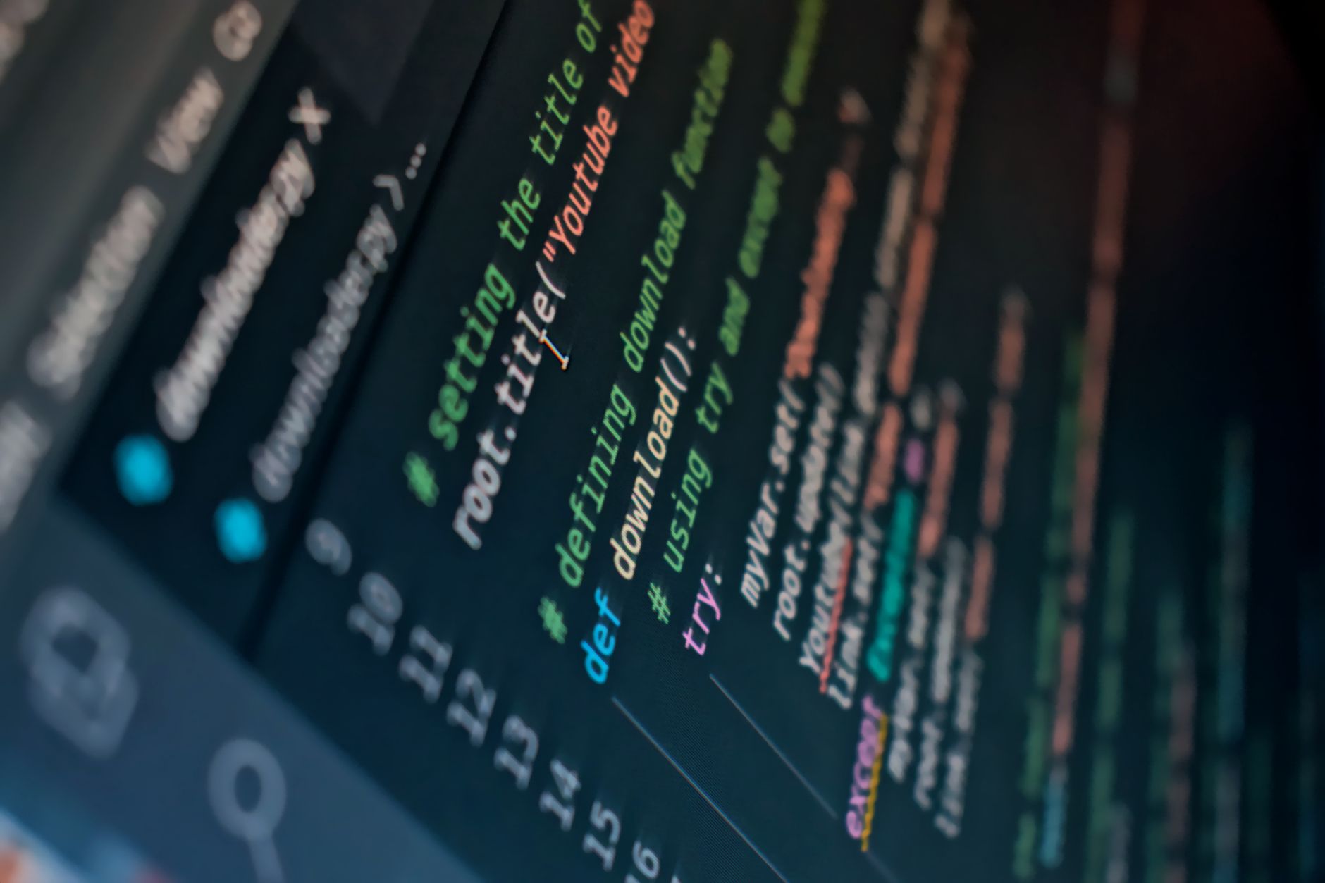
Why Does Python Visualization Matter In Data Science?
Python visualization matters because a good chart can expose a trend, an outlier, or a relationship faster than a table of 1,000 numbers. A person can spot a rising sales line across 12 months, a strange spike in one week, or a cluster of values in one glance, and that speed changes how you think.
The catch: Visuals do not just decorate a report; they act like a test for your ideas. If your model says revenue rose 18% after March 2024, a chart can show whether that rise looks steady, noisy, or driven by one weird day. That matters in exploration, because data science starts with questions, not guesses.
Charts also help you explain work to people who do not want to read 40 rows of output. A manager, teacher, or teammate can read a clear bar chart in 10 seconds, while a dense table may need 10 minutes and still feel muddy. I like plain charts with honest labels more than flashy ones, because flashy charts often hide the point instead of showing it.
The downside is simple: a bad chart can lie without using a single false number. Wrong scales, crowded legends, and too many colors can twist what the data says. That is why clarity beats style every time, especially when you need a chart to support a decision, a report, or a Python notebook that someone else will read later.
Which Chart Types Fit Python Data Best?
Pick the chart that matches the data shape, not the one that looks coolest. A line chart works well for 12 months of sales, a bar chart fits category comparisons, and a scatter plot shows how two numbers move together across 50 or 500 records.
- A line chart shows change over time, like daily users, monthly revenue, or a 2024 temperature series.
- A bar chart compares categories well, such as 8 products, 5 regions, or 12 course sections.
- A scatter plot shows relationships, like study hours versus exam score across 30 students.
- A histogram shows distribution, so you can see whether 100 values cluster near one range or split apart.
- A box plot shows spread and outliers fast, and I trust it more than a chart stuffed with tiny labels.
- A heatmap works well for dense comparisons, like a 10-by-10 correlation grid or weekly traffic by hour.
- Pie charts break down fast when you have 2 or 3 slices, but they get weak and sloppy once you stack too many categories.
Reality check: Line charts fail when you use unordered data, and that mistake shows up all the time in beginner notebooks. A chart with 6 random categories does not become clearer just because you connect the points.
- Use bar charts for category ranking, not line charts.
- Use histograms for shape, not averages.
- Use box plots when you need outliers in 1 view.
Learn Programming In Python Online for College Credit
This is one topic inside the full Programming In Python course on UPI Study — a self-paced, online class that earns real college credit. Credits are ACE and NCCRS evaluated and transfer to partner colleges across the US and Canada. Courses start at $250 with no deadlines and lifetime access.
See Programming in Python →What Essential Python Visualization Libraries Should You Know?
These four tools cover most student work in programming in python course projects and early data science tasks. Matplotlib gives you the base layer, Seaborn gives you cleaner statistical charts, Plotly gives you interaction, and Pandas plotting gives you fast built-in previews. That mix matters because no single library fits every job, and beginners waste time if they try to force one tool to do everything.
| Library | Best for | Ease / Interactivity | Learning role |
|---|---|---|---|
| Matplotlib | Full control, custom plots | Moderate / low | Foundational tool |
| Seaborn | Statistical charts, tidy defaults | Easy / low | Fast analysis |
| Plotly | Hover, zoom, dashboards | Moderate / high | Interactive sharing |
| Pandas plotting | Quick first look | Very easy / low | Exploration step |
| Typical class use | 1st charts in week 1-3 | Notebook-based | Practice before projects |
Worth knowing: Matplotlib often feels rough at first, but that roughness teaches control over figure size, labels, ticks, and legends. Seaborn saves time on common plots, and Plotly adds the kind of hover detail that makes a 20-point chart easier to read.
One smart path is to start with Pandas, move to Matplotlib, then use Seaborn and Plotly as your needs grow. That order keeps the learning curve sane.
How Do You Keep Python Visuals Clear And Accurate?
Clear visuals start with labels, scales, and honest framing. An x-axis with 12 months, a y-axis with real units, and a title that says exactly what the chart shows can do more for understanding than a colorful template ever will.
A chart gets misleading fast when you cut off the y-axis, hide the zero line, or use a scale that makes a 3% change look like a 30% leap. That kind of trick may grab attention for 5 seconds, but it can wreck trust for months. I think teachers and students both should be strict here, because data work loses value the moment the visual story drifts from the numbers.
Color needs a job. Use it to separate groups, mark a threshold, or highlight one point, not to fill space like confetti. If you use 6 or 7 colors in one small chart, the reader has to work too hard, and that usually means the chart has too much going on.
Missing data needs plain language too. If 8 of 100 rows have no value, mark that gap instead of pretending it never happened. The same goes for clutter: 15 labels, 4 legends, and 3 grid styles can make a simple chart feel like a mess. A clean chart respects the audience, whether that audience reads fast on a phone or slowly in a lab report.
How Should Students Build Visualization Skills In Python?
A strong learning path starts with simple charts, then moves toward better judgment. If you spend 3 weeks making line charts, bar charts, and histograms from real data, you build skill faster than if you jump straight to dashboards and complex styling. That matters in an online course because students often need project-ready work, not just theory, and the same habit helps when they study online for college credit or transferable credit goals.
- Recreate 5 basic charts before you invent your own style.
- Use one real dataset with at least 100 rows.
- Compare Matplotlib and Seaborn on the same plot.
- Change only 1 thing at a time: labels, scale, or color.
- Save each version so you can see what improved.
Bottom line: Small practice beats random clicking. A student who repeats 10 charts with care learns more than someone who makes 30 rushed plots and never checks the axes.
A programming in python course works best when it gives you repetition, feedback, and room to fix mistakes. That structure also helps when you want college credit from work you can point to later, because polished visuals make a stronger portfolio than half-finished notebooks. The ugly truth is that chart skill grows slowly at first, then suddenly clicks once you have seen enough examples.
Frequently Asked Questions about Python Data Visualization
You can hide trends, mislead your reader, and make a clean dataset look confusing fast. A bar chart works for category counts, a line chart fits time series, and a scatter plot shows relationships; Matplotlib, Seaborn, and Plotly each serve different jobs.
This applies to anyone taking programming in python, a programming in python course, or a data science class that expects charts and dashboards. It doesn't really apply if you only need simple spreadsheet graphs, because tools like Excel can cover that basic 80/20 use case.
Most students grab the prettiest chart first, then force the data into it. The better move is to match the chart to the question: use histograms for distributions, box plots for spread, and heatmaps for patterns across 2 variables.
Start by asking what one thing the viewer should learn in 5 seconds. Then pick one chart type, one audience, and one message before you open pandas, Matplotlib, or Seaborn.
The core tools are pandas for data prep, Matplotlib for base charts, Seaborn for statistical plots, and Plotly for interactive visuals. The caveat is that no library fixes a messy question, so you still need clear labels, sensible scales, and honest color choices.
The biggest surprise is that clarity matters more than fancy effects. A plain chart with 2 labels, a readable title, and the right scale often beats a flashy plot with 5 colors and no message.
The most common wrong assumption is that one tool does everything well. Matplotlib gives control, Seaborn speeds up common statistical charts, and Plotly helps with hover and zoom, so you pick based on the job, not on habit.
3 libraries often show up in graded notebooks: pandas for cleaning data, Seaborn for quick statistical charts, and Matplotlib for final polish. If your course counts for college credit or ACE NCCRS credit, clear charts can help you explain results in a way instructors can grade fast.
Choose the chart by the data type: bar charts for categories, line charts for change over time, histograms for one variable, and scatter plots for two numeric variables. In an online course, that choice matters because instructors want to see that you can match the chart to the question.
You can study online and still build transferable credit-level skills by practicing with real datasets in pandas, Matplotlib, Seaborn, and Plotly. A 4-tool workflow like that shows you can clean data, make charts, and explain them, which is what most data classes test.
$0. The main Python tools for charting—Matplotlib, Seaborn, pandas, and Plotly's open-source library—are free to install, so you can practice on a laptop without paying for software licenses.
Final Thoughts on Python Data Visualization
Python visualization is really about judgment. The tools matter, but the habit behind them matters more. A chart should answer a question, not show off a style. If you can explain why you picked a line chart instead of a bar chart, why you kept the scale honest, and why your colors do not fight the data, you already think like a data scientist. The best students treat every chart like a small argument. They ask what the data says, what it hides, and who will read it. A notebook with 6 clean charts can teach more than 60 screenshots packed with noise, because each visual gives the reader one clear idea. Start with the basics: Matplotlib for control, Seaborn for statistical work, Plotly for interaction, and Pandas for quick checks. Then keep practicing on real data with at least 100 rows, 2 or 3 chart types, and one goal at a time. That habit builds skill fast, and it keeps your work honest. If you make one change this week, make it this one: open a dataset, pick one question, and build the simplest chart that answers it.
How UPI Study credits actually work
Ready to Earn College Credit?
ACE & NCCRS approved · Self-paced · Transfer to colleges · $250/course or $99/month